
The Station Branding
Brand Identity, Typography, Layout
Timeline: 10 weeks
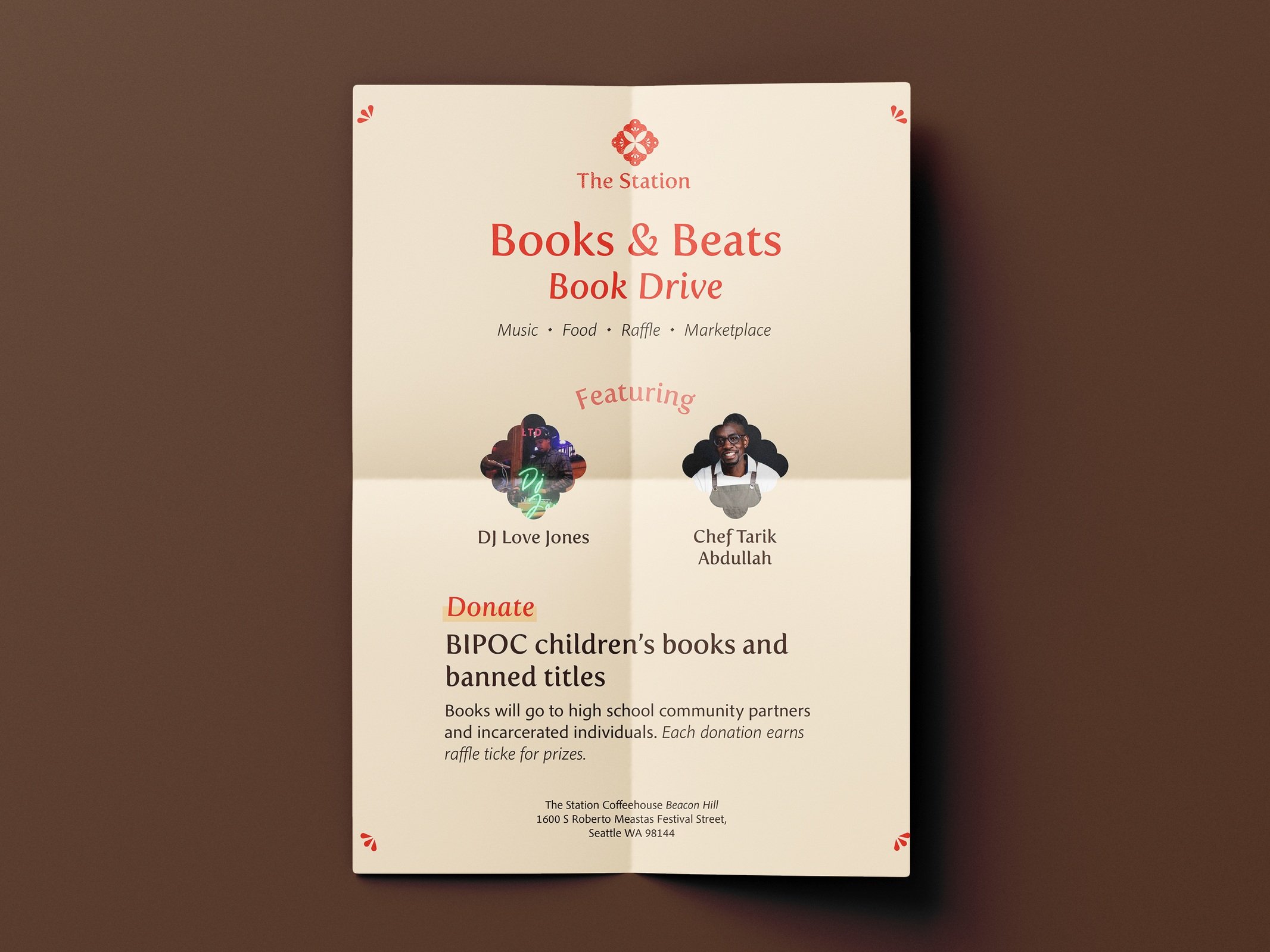
Overview: The Station is a neighborhood cafe with two locations in Seattle. It focuses on being a hub for community and creativity.
Problem: The current brand identity for Seattle cafe The Station is inconsistent and needs cohesion between all touchpoints.
Solution: The new brand guidelines for The Station have a consistent tone and identity that translates the welcoming and community focused mission of the coffee shop, while reflecting the identity of the business and founder as part of the Latinx community.


Process

Moodboard
After determining The Station’s tonal territories of community focus, creativity and approachability, I created a moodboard with visual elements that represent each tonal territory.

Logo Concept
The final logo of The Station makes reference to the Mexican craft of papel picado; traditional cut paper that has roots in pre Colombian Mexico. The logo design incorporates the shapes and patterns found in papel picado.

Typography
I chose the typefaces Fertigo and Pelago as the primary typefaces of the brand. Both typefaces are friendly and slightly rounded to connect to the logo. Additionally, Fertigo has a varied line weight that gives it a brushed quality, making reference to the rich graphic tradition of Mexican sign painting.


Initial logo sketches for The Station and Logo iterations exploring logo and text lockups.